

DESCRIPTION
Create a brochure for a company to promote their product or service.
PROCESS (Programs, Tools, Skills, FOCUS principles)
1. First I was looking for examples of brochures for inspiration on the internet.
2. I wrote a text about coconut oil benefits to using in the brochure. More than 250 words.
3. I was looking for ideas to create a logo on the Internet regarding coconut oil. Then I created a logo in Illustrator program.
4. After that, I use the Offset layout I created in 11c exercise (diptych), to make my brochure.
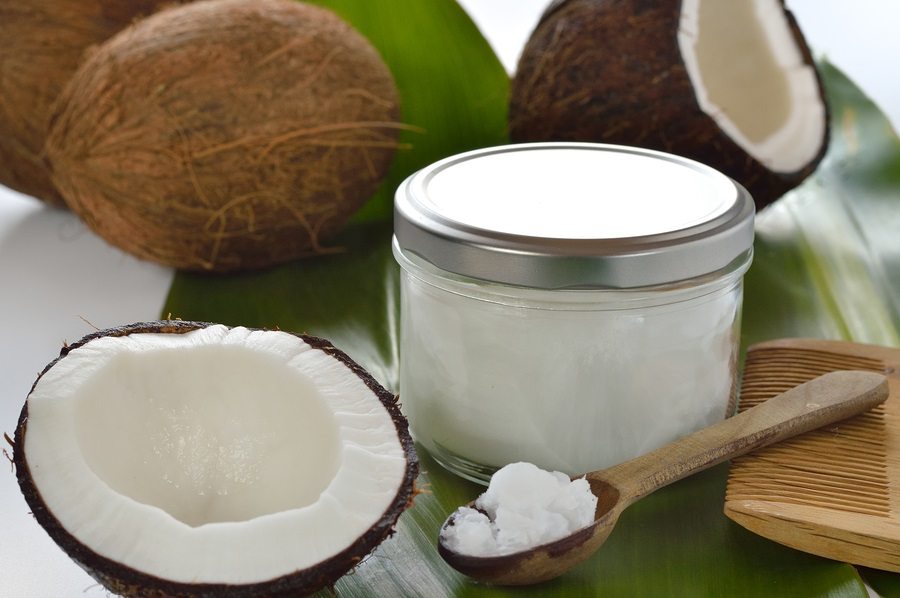
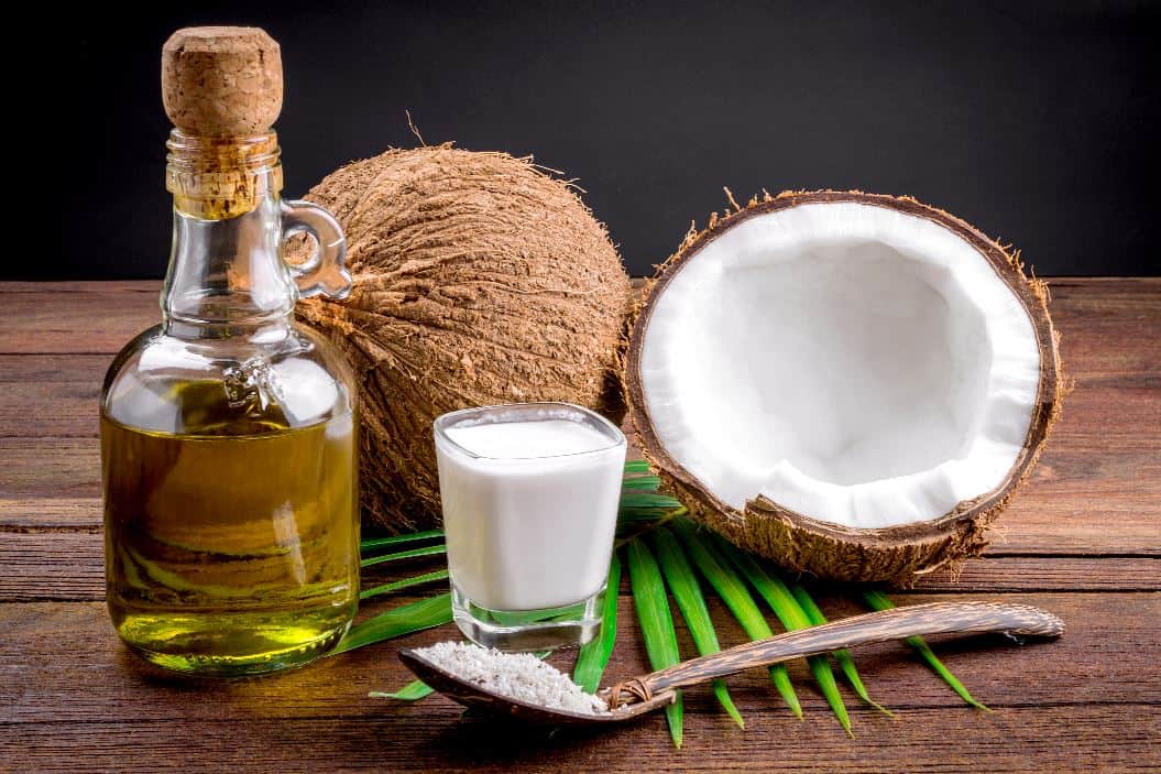
5. I found some coconut images on the internet to illustrate my project.
6. I use the brown color variations and green to represent a natural and healthy product and wrote 7 medical benefits of coconut oil.
7. I took account the critique process using the feedback to make corrections. Then I printed the two-sided brochure.
CRITIQUE PROCESS
I show my brochure to my wife to obtain feedback. She told me I needed to change the background and match the colors with logo. Also, suggested me change the typo.
Facebook Critiques: Jennifer Turner, Charlotte Huyett, Shelby Burnworth, ToniNorman and Debbie Murdock.
They suggest me to align text and some images with the text. Be careful with changing the background because looks too busy and write the header shorter.
Instructor Critique: She told me to be careful with alignment and proximity in body copy. Suggest me to use only 2 fonts and move the images to the edge to avoid white color when cropping the brochure. Use the same pattern and color with lines to match.
MESSAGE
Our products are organics and healthy.
AUDIENCE
People who are interested in good health.
TOP THING LEARNED
I learned to use the wrapping text option on InDesign. I Learned to create text patterns have learned more how to use CSS to decorate a website.
COLOR SCHEME & COLOR NAMES
Triad // brown, green, gray – Based in Green – Orange – violet
TITLE FONT NAME & CATEGORY
Neue Haas Grotesk Display Pro//Sans Serif
COPY FONT NAME & CATEGORY
Times New Roman // Transitional Serif
THUMBNAILS OF ANY ORIGINAL, UNEDITED IMAGE(S) USED IN THE PROJECT
N/A
VIDEO EXPLANATION
SOURCE OF EACH IMAGE (website name and hyperlink)

http://wellnessable.com/wp-content/uploads/2016/06/Coconut_Oil-1.png

http://coconutoil.com/wp-content/uploads/sites/6/2013/11/coconuts-Coconut-oil-on-spoon.jpg

https://s-media-cache-ak0.pinimg.com/originals/1b/7a/0f/1b7a0fa96a729a6509531e4272047e96.jpg

http://watchfit.com/wp-content/uploads/2015/01/Coconut-oil-health-benefits-and-weight-loss_02.jpg


Your brochure looks very professional! You did a wonderful job on your video explaining each of the principles you used to create your design. I now want to learn more about coconut oil after seeing your brochure and that is exactly what a brochure should make a person want to learn more.
Madelyn Okamoto Blog: https://madelynokamoto.wordpress.com/2017/03/24/brochure-project/comment-page-1/#comment-32. Her brochure also was beautiful and well designed.
Toni’s blog: https://tonialdousnorman.wordpress.com/
LikeLike
Thank you very much, Toni, your brochure was made with love and looks very nice too.
LikeLike
I love your logo. I think your color scheme is perfect for your topic. This looks really great!
Here is a link to my blog post https://cafloresblog.wordpress.com/2017/03/25/brochure-project/
Here is a link to a classmate’s post https://shawcomm.wordpress.com/2017/03/25/brochure-project/
LikeLike
Your brochure turned out great Ignacio! I can tell that you always put a lot of work and care into your projects. Everything is organized great and it is easy to read and follow. This looks very professional. You have a gift for design.
My blog: https://madelynokamoto.wordpress.com
Debbie’s blog: https://debbiemurdockblog.wordpress.com/2017/03/23/brochure-project/
LikeLike
Thank you very much, Madelyn. Your projects and skills have been increasing too.
LikeLike